Navigation:
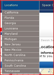
The main page of the site has a primary navigation bar that runs across the top of the screen. It contains links to “Home”, “Locations”, “Space Calculator”, “Facility Information”, and “About”. These are present no matter where you are on the site, as they are pertinent to all locations of the company.
 The primary navigation also contains secondary drop down navigation.
 On the main page of the site there is tertiary navigation that contains links to individual sites in different states. This is accessed by scrolling down the page on the main site.
 At the bottom of the page are links to other pages that users may find useful. They include “Security”, “Moving Supplies”, and “Privacy Policy”. These are important to have as some users will want the information prior to moving their items into the storage facilities, however because they are not used as often they are not included in the primary navigation bar.
 This is an efficient way to lay out the navigation, as the most important information is easily found without having to search.
Architecture:
The site is set up so that users first visit the main company page. From there, they can view information that is applicable to all locations, such as security and their policies, or they can view information regarding specific locations by choosing the state and address. This setup allows users to quickly find the information that will be applicable to them when using the company at a specific location. Had the site had information about all of the locations on one large list, it would have been harder for customers to find information about a specific location. With this design, information is cleanly organized by location and easy to navigate.
Content/Typography:
The content hierarchy is apparent through the use of bold letters, letter size, and letter color.
Heading 1:
 Large white font on blue background (horizontal line), used as titles for content.
Heading 2:
 Large black font, used as headings on pages.
Paragraph:
 Small blue or black font, used for information requiring sentences and paragraphs.
Heading 3:
 Small blue font, used as sub-information and links.
The content on the page is organized into paragraphs, as the site is used mostly to convey information about the services of the company to potential and current customers.

Grid/Structure:
The structure of this site, unlike the others, is completely horizontal. That is, it consists of a single column broken up with several rows. This limits the amount of searching that is required, as all of the headings and titles for the information are in the same place on the page as you scroll down. This layout works for this site, as the purpose is not about content, but about conveying information to customers. A customer would look up information on the site and then contact the company to make further arrangements. The site is an in-between step for customers, and because of this it was made easy to navigate and simply structured.
Iconography/Imagery:
The site uses a few icons to help users navigate the page, but less so than other pages critiqued. These include:
 Print icon allows users to print out a page containing important information about a location.
 Forward button informs users that the statement is a link.
 Information icon informs users that additional information is available.
In addition to the icons, the site also uses thumbnails and imagery to help users obtain information about the service. Some of these include:
 Map of locations. Allows users to quickly find locations close to them.
 Thumbnails of the locations. These help users to match up locations with their information.
Color Palette:
The website is made up of the following main colors:
 Blue, used for title bars and the outer background.
 Red, used for important info and accents.
 Black, used for headings and text.
  White, used for the main background of the site.
Site Focus:
The focus of the site is to provide users with information about the services provided by the self storage company. The site contains relevant information, such as security offered and other services, so that users are more likely to choose the company when needing a storage location. The site provides directions and contact information for the different locations available. Two important features of the site are the space calculator tool and the breadcrumbs.
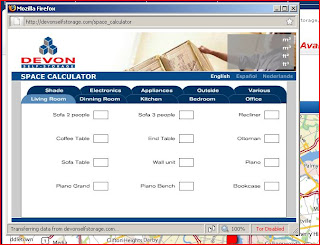
The space calculator tool allows users to determine what size space they should expect to be renting from the company. It takes an input from the user, such as the room they are packing up or the type of furniture, and turns it into a unit size that can be asked for when reservations are made.
 The breadcrumb feature follows the user’s navigation through the site. This allows the user to always know where on the site they are and makes it easier to backtrack to a specific page if needed to view information on other locations or services offered.
Improvement:
An improvement that could be made to the site is that the primary navigation bar could be made to look more like buttons and have larger text. This would make it look more clickable and important, unlike current where it is “just kind of there.”
No comments:
Post a Comment