Case Studies #2: www.woot.com

,
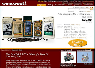
This Case Study is in regards to the website www.woot.com, a site that provides discounted items with inexpensive shipping every day.

Navigation:
The navigation of the site (on the home page) is set up as follows. There is a primary navigation bar at the very top of the screen that includes "today’s woot" (this brings you back to the home page for the day), "the blog" (a place for woot members to get together and talk about different topics), “the community” (information about previous deals, contests, and member discussions), "write us" (different ways to get in contact with woot), "your account" (self explanatory), and “what is woot” (information regarding woot’s purpose and methods).


Above the primary navigation bar is an additional information section, where a secondary deal is available. This section also has a place for member comments and a link to become a sponsor.

This navigation is always at the top of the page no matter where you are in the site. Because this site shows the day’s deal, the secondary navigation is located below the picture of the item. It consists of a tab-interface with the option to either view Product Info or Product Stats.

To the right of the secondary navigation are pictures and links to sub-domains for the site. They include shirt.woot.com and wine.woot.com.


They navigation to these sites are exactly the same as the main site woot.com (although in different color schemes).


The location of the primary navigation bar allows for information from the website to be easily found. The primary navigation is just to the right of the banner of the site’s logo, and active pages are easily discernable from inactive (it is easy to know which page you are on).

At the bottom of the page, there are legal disclaimers and links to the site’s Terms of Use and Privacy Policy.

After clicking on the "the community" tab, I can view previous deals and the comments users have made. I can also change the page to show contests put on by the site and general discussion boards.


Architecture:

Unlike most sites, the architecture of woot.com is very shallow. This is because unlike other sites, the main function is to provide users with the day’s deal. Clicking on a link in the primary navigation brings you to that page, and from there you navigate to another page on the primary navigation bar or to a sub-domain of the site. Even previous woot deals can be easily found by clicking “the community” in the primary navigation bar. This makes the site very easy to navigate, as all of the information can be found without many clicks of the mouse (very flat architecture).


Content/Typography:
The content hierarchy is apparent through the size of the text and the letter color. Text next to the item is in black, while text in the description is in white.


Heading 1:
Large font, bold, in the site’s orange color. This is used solely for buying the item (or informing that it is sold out, as shown here)

Heading 2:
Large black font


Heading 3:
Medium white bold font

Heading 4:

Used as headlines in the links section of the page. Site’s orange color, bold, and overlined.


Paragraph:

Small white font (sometimes set to even lower letter size to show “two conversations” at once)

In my opinion, this is a very effective typography setup. I can quickly and easily find the most important information, which is in larger text and bold. The one piece of information that I need to see first “pops” off the page when I open it (the button to buy or the statement that the product is sold out.) The text also follows the color scheme of the page, while still making the text easy to read and does not create “vibrations” in the text. A possible change to make the text easier to read quickly could be to increase the letter spacing in the top bar displaying the side deal. Currently, the letters look too close to each other; however the deal is still able to be read.


Content on the page is well organized. The vital information is located at the top of the page, next to the image of the product. More information about the product can be found by scrolling down the page, and I can easily tell where I am by the activated tab in the primary navigation bar.

Grid/Structure:

The structure of the site is set up as two rows at the top of the page and two columns at the bottom.

At the top of the page, the top row contains the banner, the side deal, and the primary navigation. The second row contains two columns, with the image of the deal on the left and the main information about the deal on the right.


At the bottom of the page, the page is divided into two columns with the left column containing a comical story about the product as well as the product info, and the right column links to sub-domains and news.


This structure is the same for the other sub-domains, and helps keep the image of the site uniform and easy to navigate when going from site to site.

After clicking on the “the community” tab, the layout of the site changes slightly, replacing the product content area with a single column with information arranged by date. This keeps the layout simple and easy to navigate, as it is not what the general user will be used to when using the site.


Iconography/Imagery:
The site uses only three images on the main page. These are for the product at woot.com, the product at shirt.woot.com, and the product at wine.woot.com. This prevents the user from having to search for what the deal of the day is, as it is front and center on the homepage.


Clicking on the product image opens a popup window that shows an enlarged view of the item.

The main page of the site contains a few icons that make it easier to navigate and view. These include a “Go” button to sign in, a play button for the “wootcasts”, and a simple block image for bulleted items.


When navigating to the feedback page, current information about the purchase history of users is displayed in easy to view bar graphs and a map displays where users are buying the item from.


Color Palette:
The color palette of this website consists of three main colors (black, green, and orange) and shades of them:
Dark green:

Light green:


Black:


Orange:


Gray:

White:

The color scheme of the website draws in your focus to the main content, the sale going on at the time. The upper bound in green and the lower bound in green box in the main content, making it stand out more. This really helps to accentuate that the sale is the most important part of the site.

Site Focus:
The purpose of the site is to provide users with access to a discounted item that changes every day. The product has a picture(s) and description, and can be from almost any category. A very important feature of this site is the blog sections. This is where users can ask questions and post answers regarding the current item and its features. This allows users to find out more information about the product without having to leave the site, a big deal since most users will tend to visit sites such as Amazon, CNet, or Yahoo to look up reviews and see customer feedback. Users can view all of this and get answers to questions quickly without having to leave the woot website.


Improvement:

An improvement to the site that would make it easier to navigate would be to add a couple more links to the primary navigation, or even have a drop-down navigation system. I feel that the “the community” tab is very vague, and unless I have clicked on it before I wouldn’t be sure of what it links to. Having a drop-down on this tab could provide more information to the user, such as “contests”, “previous woots”, etc.

Case Studies #1: www.instructables.com

,
This Case Study is in regards to the website www.instructables.com.

Navigation:
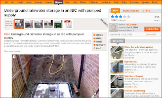
The navigation of the site (on the home page) is set up as follows. There is a navigation bar at the very top of the screen that includes "Home", "Explore", "Community", "Submit", and the Login/Search area.
This navigation is always at the top of the page no matter where you are in the site.
The primary navigation bar at the bottom of the banner contains the main elements of that divide the site into its many components.
Secondary navigation is broken up into two parts. On the left is a listing divided by category and keyword.


And on the top of the content is navigation splitting up (paginating) the information by content type.
These groupings make it easy to find certain information provided by the website quickly and easily. The primary navigation bar is the most prominent on the site, taking up the entire width of the page and is located at the bottom of the banner (where the start of the page's info would be or the "typical" location of the navigation bar on a website.) This navigation bar does not disappear when clicking from page to page. The category and tabs appear after clicking on a subject and going to the second level of the site. I can tell that it is navigation because it is a different color from the main section and is set off on the left and top of the pages. Also, after clicking a link in the primary navigation bar (while on that page) the link changes color. However, the content links do not change for pages previously visited. This could be because the site contains information that is more arranged for people who have a specific idea in mind. That is, a person would click "Craft" because they were looking for craft-related projects. Once there, they would not want to be reminded about which links they had clicked previously because the content is continuously updated and previous projects can be searched for.

I always know where I am on this site because of both a list on the left of the page (which is also clickable) that lists the subcategories that I am current under and the primary navigation bar which changes the color of the category link. Also, by clicking the "Home" button at the top of the screen I can get back to the first page at any time.

Architecture:
The site does not appear to have a deep architecture. The main purpose of the site is to provide access to different types of projects in all types of categories (technology, crafts, food, outdoors, etc) and list them in a way that is easy for anyone to find something that interests them. The site has only a couple of levels and these would be the main level, which has majority of the content, and then the instructions for the actual project. Every page has the primary navigation bar and any other page (except for individual projects) can be navigated easily. For this reason, the architecture of this website is very flat. I think that this is a very good thing because it allows me to find the projects I'm interested in much faster through less clicking. I can go from main page to a category and then perhaps a subcategory before finding the project I want. This keeps me from having to guess where a link would be or what page certain information would be found on.

Content/Typography:
The content hierarchy is very apparent through the use of bold letters, letter size, and letter color. For example, on the home page of the site:
Heading 1:
Large font, bold, all capitals

Heading 2:
Large font, bold, orange color


Heading 3:
Small font, bold


Paragraph:
Small font


I think that this is a very effective way to set up the typography of the site as it makes important sections of the page more visible to users while also incorporating the color scheme. The only fix I would make to the site typography is to increase the letter spacing of Headline 2 text, as a couple of lines of it cannot be read as fast as normally spaced letters.

The content of the site is arranged in a way that prevents a user from becoming lost in searching for a specific project. The names of the links in the primary navigation bar are clear and concise and are easily understandable. Also (and importantly) there is no "Other"/"Misc" link to confuse users about the content located on that page. However, because projects are categorized by keywords and terms, it is possible to find a project under several of the main categories (making it easier to find the project).

Grid/Structure:
The grid structure of the pages stays consistent as I go from one page to another. For example, on the home page the layout is:
There is an upper section, a lower section divided into smaller groups, and a right section. Clicking on a project, the layout is:
Again, there is an upper section, a lower section that contains project details, and a right section. However, clicking on the project changes the content of the sections. For example, on the home page the upper section contained a flash with thumbnails of top projects on the site. Below this was a listing of top projects in different categories, and on the right was a list of competitions underway. When clicking on a project, these change to information regarding the project. Most importantly (and a great feature of the page), the right section changes to similar projects that others have found interesting/useful. This saves time when looking for a type of project, but not necessarily a specific one. With this type of layout, the first thing that I notice (the focal point) is the flash animation on the home page and the step thumbnails on the project page. These are both important, as they indicated what projects people have found the most interesting/fun and how easy a project is (through the number of steps)/how well documented it is. I notice these two things because of their location on the page (middle center when the page loads) and their relative colors to the surrounding page (the flash video is darker and the thumbnails are in a gray box).

Iconography/Imagery:
Due to the nature of the site, it is very important to use pictures. The main goal of the site is to provide information about projects, and users want to see steps and completed projects. Their layout is pleasing to the eye because the thumbnails are large enough to be seen easily, but small enough to allow several projects to fit on a single page.
If I want to see more images of a project, I can either click the thumbnail or the link below it. However, I can also distinguish different projects from each other without having to read their titles with the thumbnails. Because of this, the images are a vital factor in the success of this site.

In addition to the images and thumbnails, there are two small icons that aid in laying out the projects in a way that suits the user. These icons are:
These two icons are very easy to figure out, as their meanings are apparent when connected with both the current layout of the page and their location. Currently, the "thumbnail" layout is selected, as it is underlined in orange and is how the projects are organized on the page. If I wanted to see thumbnails and descriptions, I would click the second icon and get the following layout:
As you can see, the layout is exactly as indicated in the icon, making them easy to use for users with different preferences.

Color Palette:
The color palette is very simple for the website. The site is made up of five distinct colors:
Bright orange:


Black:


Gray:


White:


Dark yellow/orange:


The banner (upper section of the site) is the bright orange color and is separated by the primary navigation bar, which is dark yellow/orange, from the content area of the site. Less important links and content is a shade of gray and the background of the website is white.
I think that these colors were chosen because it makes the site much different from other sites, where bright colors are not used. Because the site is composed of user content, the color of the site is not going to distract users from accessing projects they want information on. This could be reason why only two colors were chosen in addition to the "normal" ones (black, white, gray).
Also, having the bright orange bar on top cleans up the look of the information below, making it look more organized and effective on a plain white background (as opposed to a colorful background or a site that is all white with black text).

Site Focus:
In my opinion, the purpose of this site is to easily provide users with projects and the steps required to complete the projects for almost anything they can think of. These projects are all user submitted. The search box at the top of the page allows a user to look specifically for a certain project without having to search the category or categories that it falls under, and keywords for each project help users find similar projects.

I feel that a very important feature about the site is the user feedback. Users can give feedback on a a project in two different ways. They can either post a question/comment, or they can rate the project:

Both of these features allow users to quickly determine how well a project is documented and/or constructed, in addition to looking up questions others have and answers or asking their own questions. Due to the purpose of the site, this is one of best features available for users while determining which project(s) to accomplish.

If I was to improve on the site, I would make a following changes. I would rearrange the content on the home page and put the "community" above the "contest" section. I feel that the site is more about the interaction and sharing of ideas and projects, so this would come before a contest between members (this is a personal decision based on how I view the website. some users may visit the site just to compete in the contests. however, I think that a customized site for such users could be created after they log into the site.) Also, I would decrease the size of the orange banner at the top of the page. I feel that it takes up a lot of space and for people using laptops (like myself), it prevents much of the content from being visible on the screen without scrolling down. I would either make it thinner or use the space to show projects that are customized to the user. For example, showing projects that are similar to ones that I have recently looked at in this space would be an effective way to use space on the site without wasting.